If your paid social ads keep getting cropped in all the wrong places, you’re not alone. Creative teams and media buyers alike know the frustration of uploading beautiful ad designs—only to see logos or CTAs chopped off in the final feed. With platforms like TikTok, Instagram, and Facebook constantly shifting their layouts, staying updated on creative safe zones is non-negotiable for performance marketers.
At Pantelope, we obsess over the intersection of performance and design. Our creative team has spent hundreds of hours testing, tweaking, and documenting the most up-to-date safe zones to help ensure your creative assets perform exactly as intended—no surprises, no cutoff copy.
???? Want the full walk-through? Watch the video on our YouTube channel where our Creative Director, Grace Jacobsen, break down each format with visual examples and real-world tips.
Why Safe Zones Matter for Performance Creative
When your text or design elements are cropped, you’re not just dealing with aesthetic issues—you’re risking conversion loss, brand inconsistency, and wasted media spend. Ad creative isn’t just about beauty; it’s about clarity, visibility, and function. The best creative:
- Captures attention within seconds
- Communicates your value prop clearly
- Drives users to click, convert, or take action
But all of that falls apart if your core message is obscured.
Let’s break down exactly what you need to know by platform.
Facebook & Instagram Stories / Reels: Stick to the 60px Rule
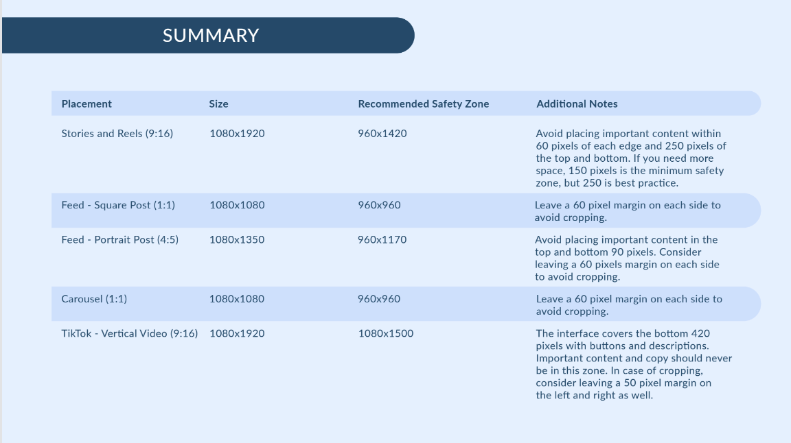
Recommended Dimensions: 1080×1920 (9:16 aspect ratio)
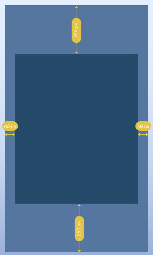
Safe Zone: 960×1420
- 60px padding left and right
- 250px padding top and bottom (150px minimum)
Why it matters: Stories and Reels often overlay UI elements like profile names, reactions, or swipe-up buttons. Keeping core content within a 960×1420 window ensures nothing important gets hidden behind Instagram’s or Facebook’s interface.
Pro Tip: Avoid placing your CTAs or key visuals near the bottom of the screen. Keep them center-weighted or upper-middle.

Facebook & Instagram Stories / Reels Safe Zones
Instagram Feed (Square Posts): The Silent Cropper
Recommended Dimensions: 1080×1080
Safe Zone: 960×960
- 60px padding on all sides
Why it matters: Instagram squares are notorious for auto-scaling, especially when shown on mobile feeds or within carousel sliders. Our team at Pantelope noticed repeated cases where logos and messaging were partially cropped—prompting this update.
Fix: Design with 60px of padding on all four sides. It may seem excessive, but it preserves clarity and consistency.
Instagram Portrait Safe Zone

Instagram Portrait Posts: Vertical with a Twist
Recommended Dimensions: 1080×1350
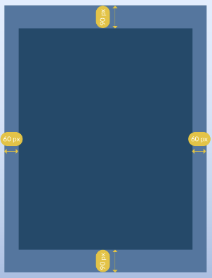
Safe Zone: 960×1170
- 60px left and right
- 90px top and bottom (minimum)
Why it matters: These posts offer more visual real estate, but they’re scaled differently across device sizes. By respecting the safe zone, you ensure that your visuals remain centered and unclipped.
Instagram & Facebook Carousels: Consistency Wins
Recommended Dimensions: 1080×1080 (per frame)
Safe Zone: 960×960
Even though carousels don’t show the same cropping behavior as feed posts, consistency is key. Applying the same 60px buffer across your carousel images prevents visual disruption and improves swipe engagement.
TikTok: Respect the Bottom (and the Right)
Recommended Dimensions: 1080×1920
Safe Zone Considerations:
- Bottom: Leave 320–420px for captions and UI
- Right: Leave 120px for buttons
- Top: Leave ~100px for username overlays
Why it matters: TikTok’s user interface dominates a significant portion of the screen—especially the bottom. When captions expand or viewers comment, even more of your content gets covered. Designing with a generous safety buffer ensures your content remains untouched.
Reminder: Unlike Meta platforms, TikTok doesn’t crop the left side heavily—so keep design-weighted elements slightly to the left or center.
Performance Creative Best Practices
Keeping your visuals in the safe zone is just one part of a high-performing creative strategy. Here are a few principles we apply at Pantelope through our Performance Creative Marketing service:
1. Design for Scroll-Stopping Impact
Your first second matters most. Hook users visually, then deliver your message.
2. Test Creative Variations
Try different versions with varied color schemes, layout orientations, and messaging tone. A/B testing creative is just as important as testing audience segments.
3. Make It Mobile-First
Over 90% of paid social traffic comes from mobile. Use legible fonts, tap-friendly layouts, and ensure your messaging fits within a small screen experience.
4. Don’t Forget Branding
Logo placement should remain in the safe zone—but don’t fade it out too much. Strong brand presence = stronger recall and remarketing performance.

Get the Cheat Sheet: Safe Zones at a Glance
We’ve taken all of this knowledge and turned it into a downloadable creative safe zone cheat sheet. Whether you’re designing in-house or managing a creative team, this PDF will help you streamline your review process and avoid the most common design pitfalls.
???? Click here to download the cheat sheet and keep it handy for every new campaign.
Final Thoughts: Design with Platform in Mind
Digital platforms change constantly—but your creative strategy doesn’t have to fall behind. Following these updated safe zone guidelines ensures your paid creative isn’t just good-looking, but also high-converting.
Whether you’re designing in-house or working with a creative partner, remember: smart design is performance design. And it starts with the details—like 60 pixels of breathing room.
Need help building high-performing ad creative that drives results? Let Pantelope’s creative experts give your campaigns the edge.
???? Explore our Performance Creative services or contact us for a custom audit.
About the Author
Grace Jacobsen is the Creative Director at Pantelope. With years of experience in performance marketing, branding, and creative strategy, she helps brands translate ideas into high-converting visual stories that perform across every channel. She’s passionate about bridging the gap between data and creativity—her current favorite project focuses on connecting analytics directly to performance creative. Grace kicks off every morning with a cinnamon vanilla latte and a fresh round of design inspiration.

